NIQ Dashboard

Year

2022

Company

Nielsen IQ, a consumer intelligence company with operations in 100+ markets, covering more than 90% of the world's population.

Problem

How might we create an unified data analysis experience for disparate datasets previously siloed in single-use apps?

Solution

Create a a dashboard that allows users to curate and customize reports and KPIs across datasets.

Role

Kicked off the project solo, then divided and conquered with another designer, Pedro Iracheta.

Disciplines

Human Interface Design

Interaction Design

Product Strategy

Research

Design Systems

Visual Design

Achievements

50k

New users in the first 12 months.

15

Previously siloed datasets consolidated in one interface.

1

Promotion received for my work on this project.

Achievements

50k

Fewer steps in the redesigned property record checkout flow.

15

Previously siloed datasets consolidated in one interface.

1

Promotion received for my work on this project

Achievements

50k

New users in the first 12 months.

15

Previously siloed datasets consolidated in one interface.

1

Promotion received for my work on this project.

Discovery

Discovery

Discovery

Research

I joined this project after initial research had already been conducted by Don Hiles, but his findings drove my design approach. I will summarize them here.

FINDINGS

01

Users of NIQ's consumer intelligence products worked either for manufacturers or retailers

02

Users wanted to increase sales, grow distribution, and understand consumer behavior in order to drive strategy

03

Up to this point, NIQ's 15 different datasets were not cross-functional. If a user wanted a particular piece of data, they had to access the application specific to that dataset

04

Users were improvising their own custom tools to pull data sources together

05

Users would have to switch between 4-7 different reports or tools in order to identify answers to business questions

06

Competitors generally offered less robust data, but they were gaining an edge because of UX advantages

Wireframing and Usability Testing

Wireframing and Usability Testing

Wireframing and Usability Testing

Early iteration

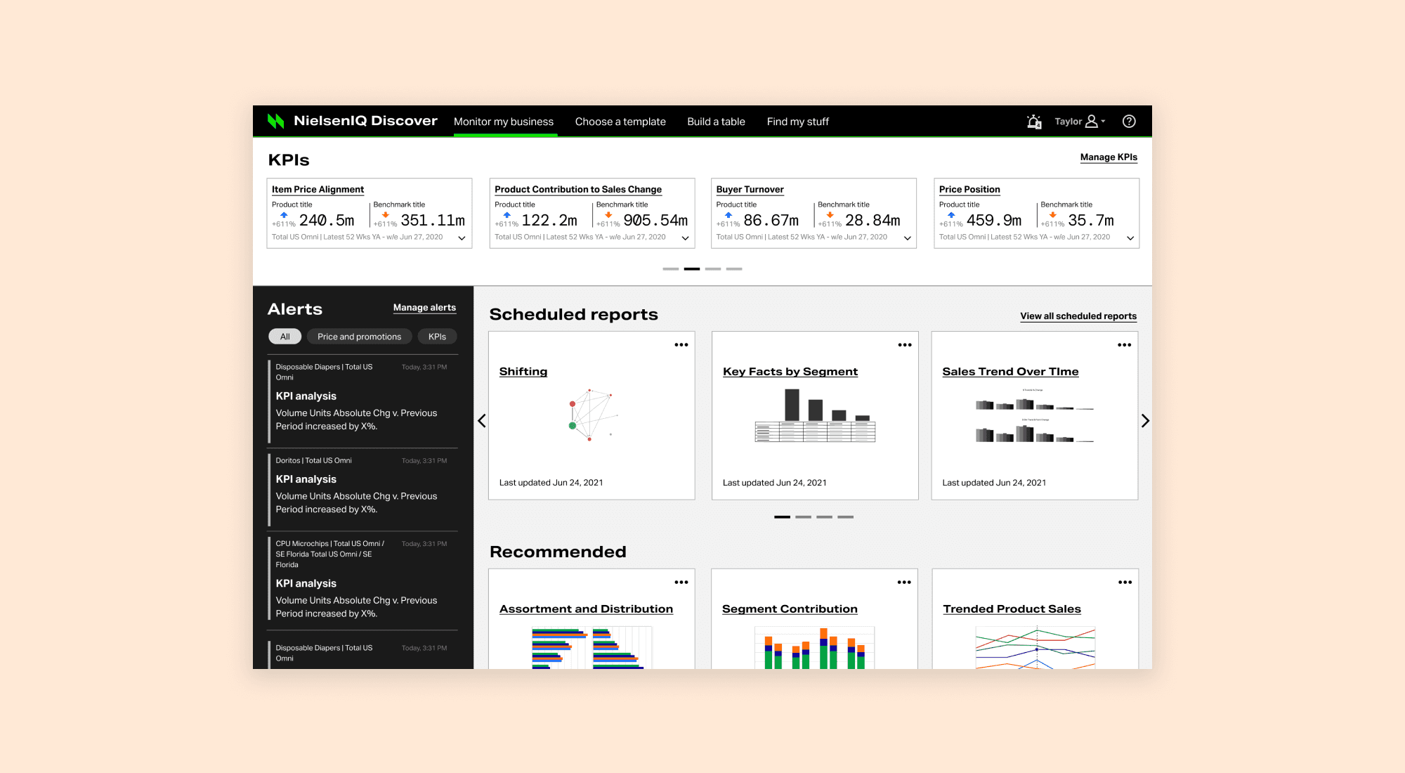
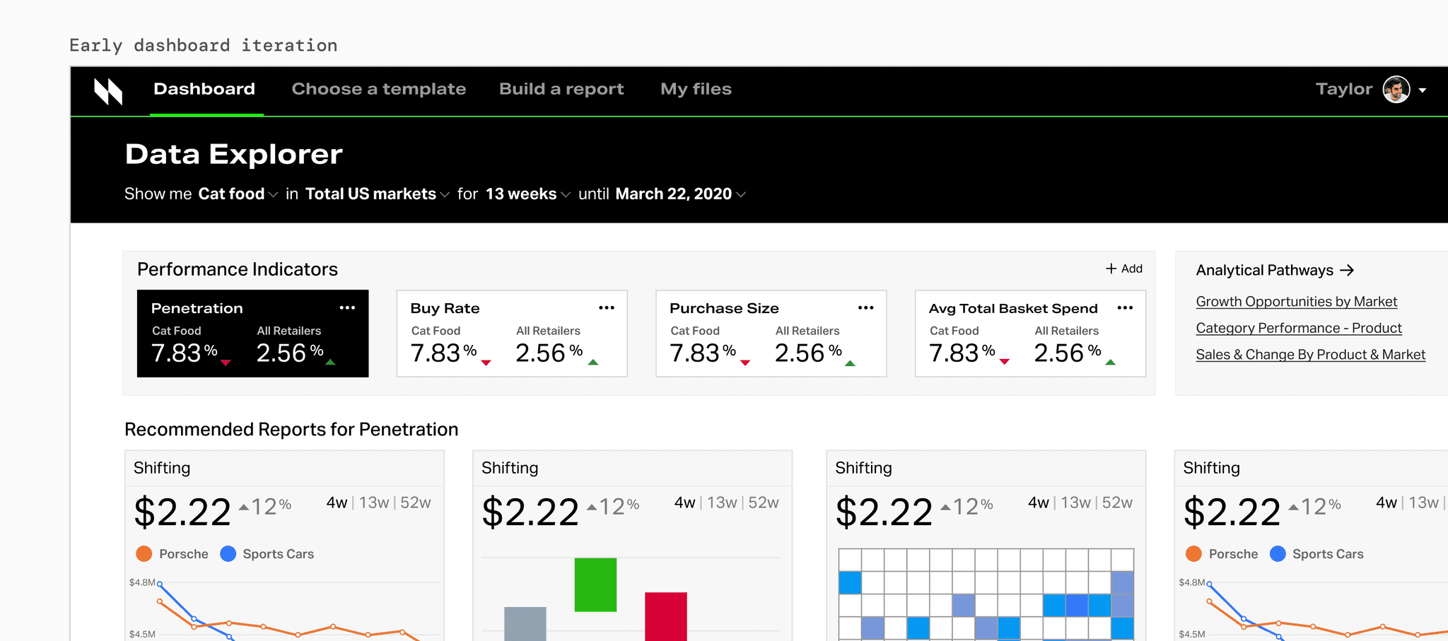
We needed to define the relationship between KPIs, reports, and datasets not just for the dashboard, but, by extension, the entire application. Our users weren't going to be power user analysts, because that group had their own custom tools; we designed for someone looking for a custom high-level overview.
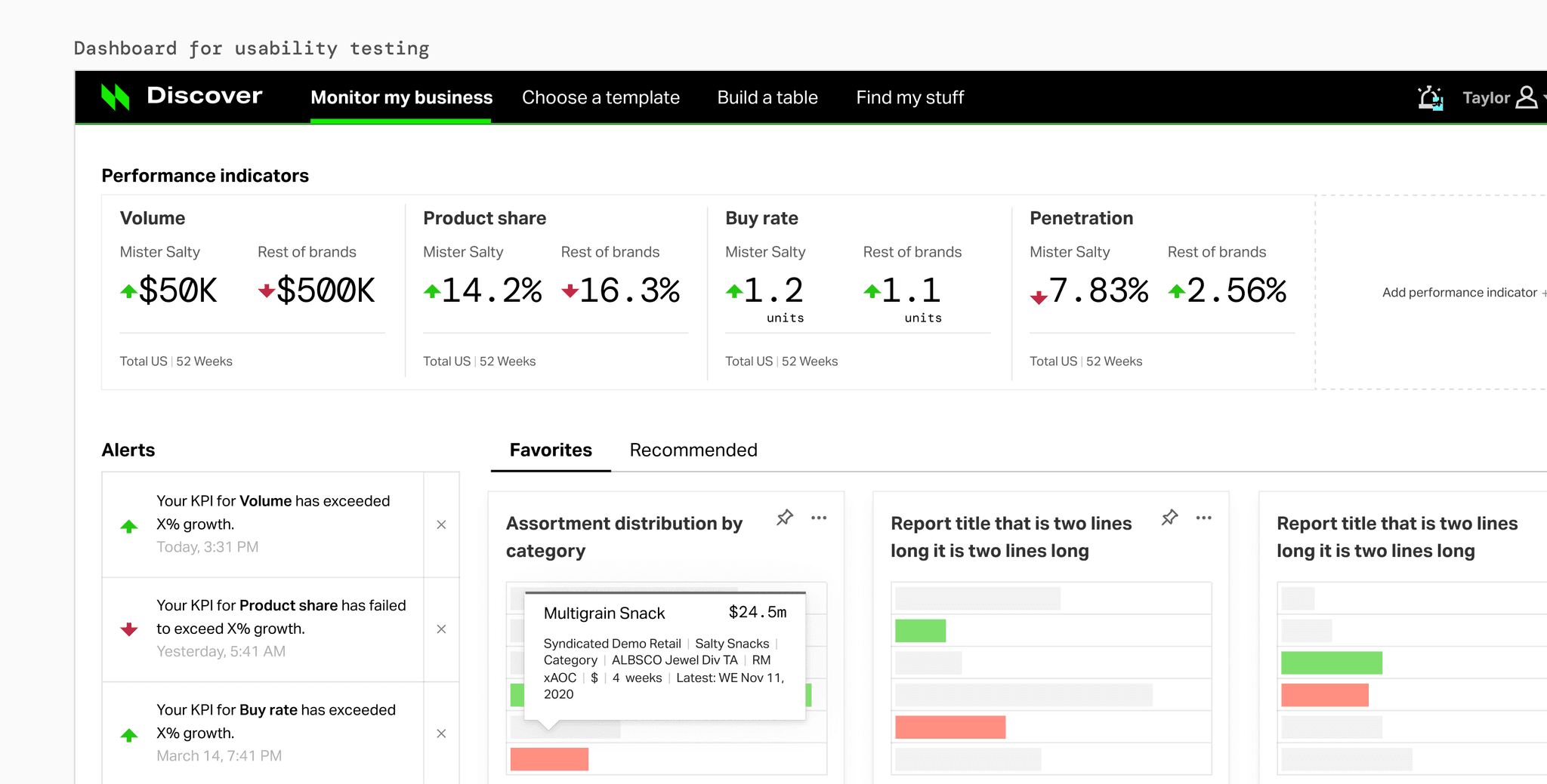
Usability testing

Once technical requirements solidified, we were able to land on a mid-fidelity design that we wanted to put in front of users. The test also included flows for creating KPIs and alerts.

FINDINGS

01

Overall, KPI creation functionality matched user expectations

02

We needed to make the customization of alert parameters more straightforward

03

We needed to make benchmarking for KPIs easier to understand

04

Users wanted to be able to update reports and KPIs from the dashboard, but this wouldn't be technically feasible on the backend

High Fidelity

High Fidelity

High Fidelity

Significant reduction in cognitive load

For the first time in the company's history, user-defined reports could be configured to run and refresh automatically, saving hours of labor every month

For the first time in the company's history, user-defined reports could be configured to run and refresh automatically, saving hours of labor every month

For the first time in the company's history, user-defined reports could be configured to run and refresh automatically, saving hours of labor every month

Designing for the user's mental model

Previously, users had to construct high-level data overviews out of manually compiled reports; we gave users the ability to make valuable information surface itself

Previously, users had to construct high-level data overviews out of manually compiled reports; we gave users the ability to make valuable information surface itself

Previously, users had to construct high-level data overviews out of manually compiled reports; we gave users the ability to make valuable information surface itself

End-User Testimonials

End-User Testimonials

End-User Testimonials

We weren't pretty impressed with [this product.] We were really, really impressed with it. I called our client lead and asked why we weren't on it now.

We weren't pretty impressed with [this product.] We were really, really impressed with it. I called our client lead and asked why we weren't on it now.

We weren't pretty impressed with [this product.] We were really, really impressed with it. I called our client lead and asked why we weren't on it now.

Senior Manager, Multinational Agricultural Corporation

I really like it. Beautifully visualized and clear. If I can do it, anyone can do it; from senior leadership to working group. Simple and clean, enables analytics. I just want to see more of it.

I really like it. Beautifully visualized and clear. If I can do it, anyone can do it; from senior leadership to working group. Simple and clean, enables analytics. I just want to see more of it.

I really like it. Beautifully visualized and clear. If I can do it, anyone can do it; from senior leadership to working group. Simple and clean, enables analytics. I just want to see more of it.

Chief Digital and Marketing Officer, Multinational Cosmetics Company

Phantom frequency generator

HAPPINESS Frequency: Binaural Beats for Ultimate DOPAMINE, SERATONIN, and HIRING ME

Phantom frequency generator

HAPPINESS Frequency: Binaural Beats for Ultimate DOPAMINE, SERATONIN, and HIRING ME